Pallant House Gallery
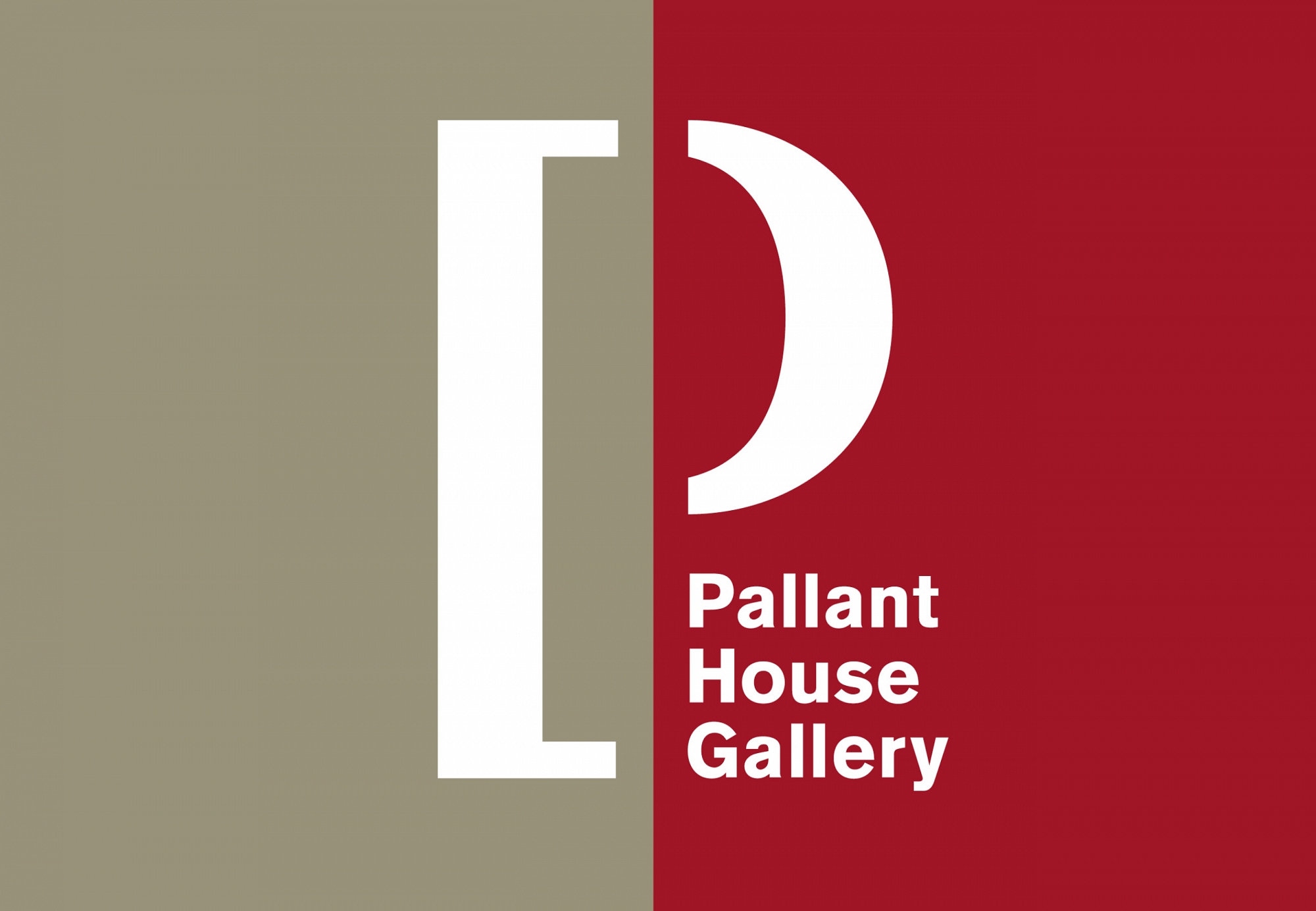

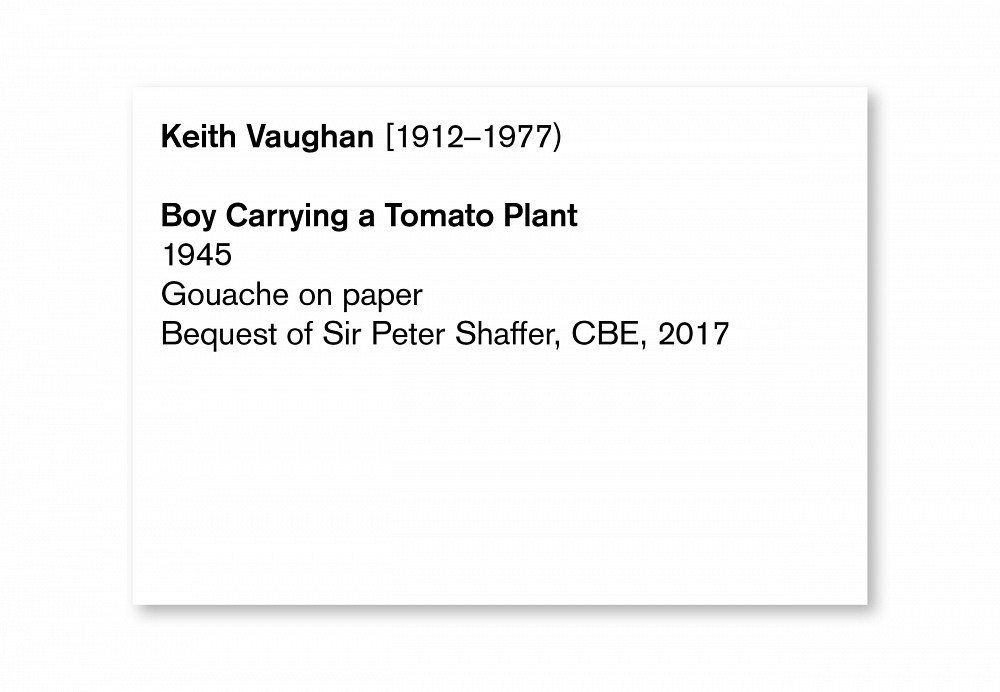

Pallant House Gallery, in Chichester, houses one of the most impressive collections of British Modern art in the country. Many of the artworks in the gallery are donated as entire collections by patrons with a particular interest in modern art. It is ultimately a collection of collections. The gallery is composed of two buildings - the original 18th century town house and the beautiful 21st century modern extension.
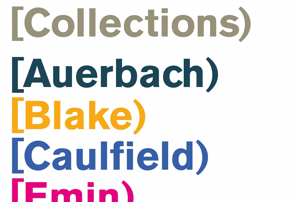
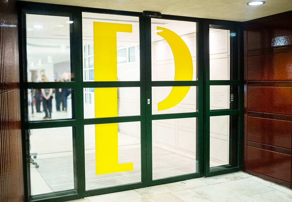
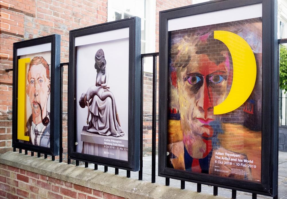
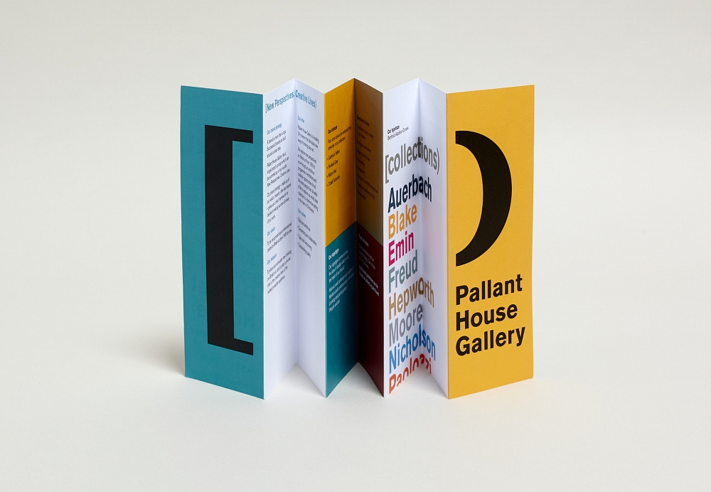
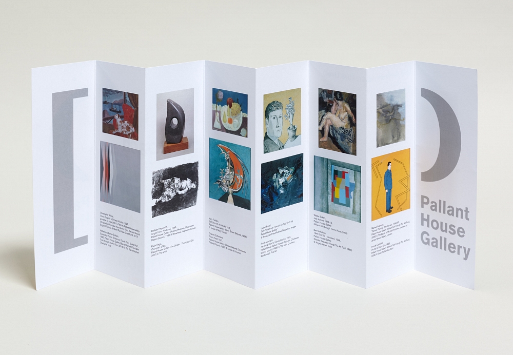
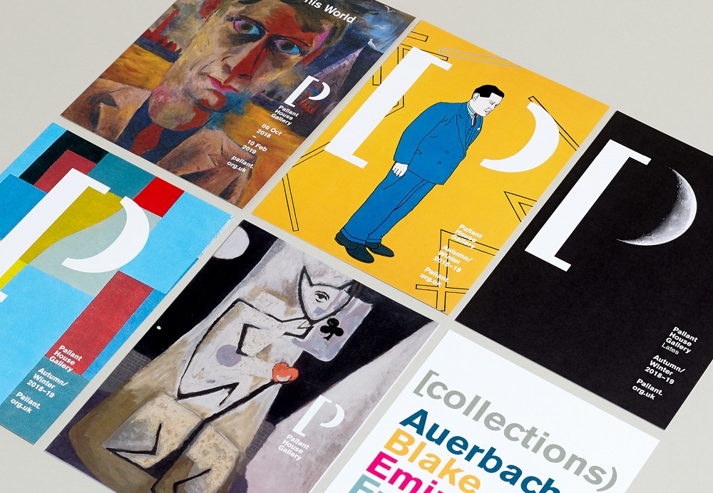
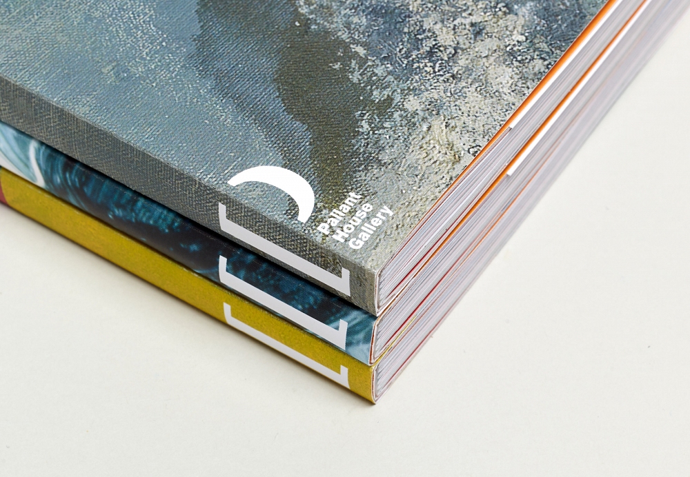
To reference the idea of a ‘collection of collections’ -and to reflect the duality of the buildings - we combined a square and round bracket to create a ‘P’. In application the brackets become a framing device, literally containing the works of art within the gallery and to showcase the workshops within the spaces. [In editorial use, the logo is echoed by using a straight bracket to open a sentence, and a round one to close it). This editorial idea used on artist dates on picture captions, job titles and posters - wherever we can to subtly reinforce the identity.
We created a bold and distinctive colour palette directly from the artworks in their collection, named after paint colours and designed to complement each other. Portland Grey is picked from ‘The Estuary’ by Michael Andrews, Alizarin Red comes from ‘China Dogs in a St Ives Window’ by Christopher Wood, Cobalt Turquoise comes from ‘Thorn Head’ by Graham Sutherland and Cadmium Yellow from Patrick Caulfield’s ‘Portrait of Juan Gris’. Often two colours are used at once to echo the duality at the heart of the brand.
Strategy – Jo Marsh, Winster Marsh
Lettering artist – Charles Stewart